CO-DESIGNER, APR 2014 - AUG 2017
A San Francisco non-profit wanted to better connect temporarily unhoused people with the vast array of city resources available to them. A fellow designer and I worked together to propose a solution. All images displayed are mine for ease of reference, but my work greatly benefited from our teamwork.
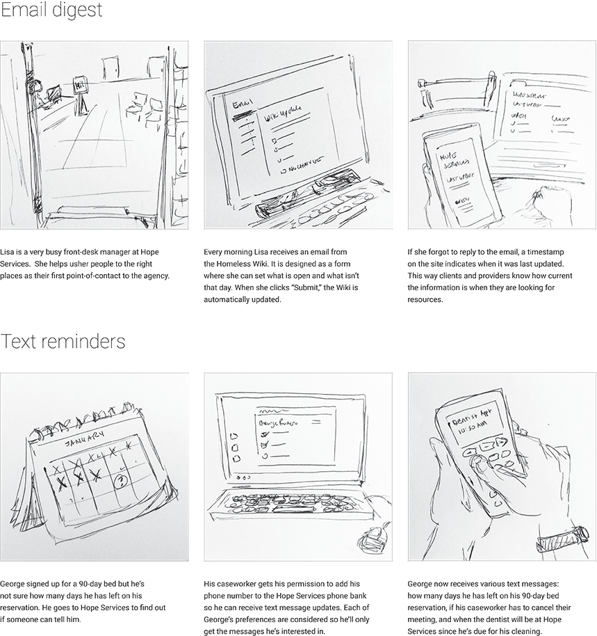
It's important to design with your users. We first conducted interviews with people who were currently unhoused and observed clients at partner facilities. We witnessed a range of technological literacy.
Based on these interactions, we developed a series of storyboards targeted to two personas. One was tech savvy, and the other not as much. Caseworkers reviewed sketches of scenarios created with the personas.
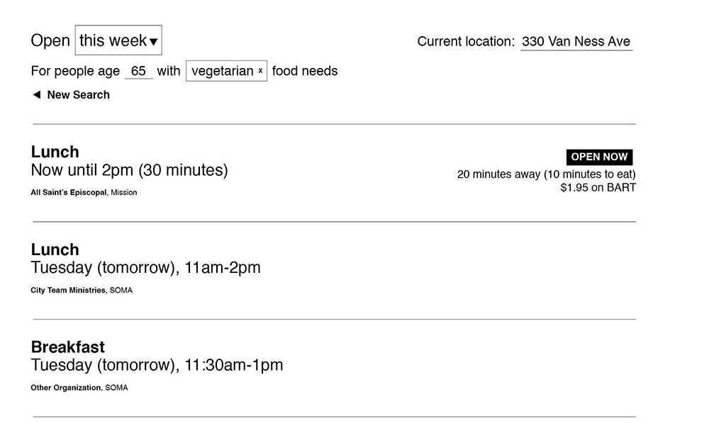
Wireframes
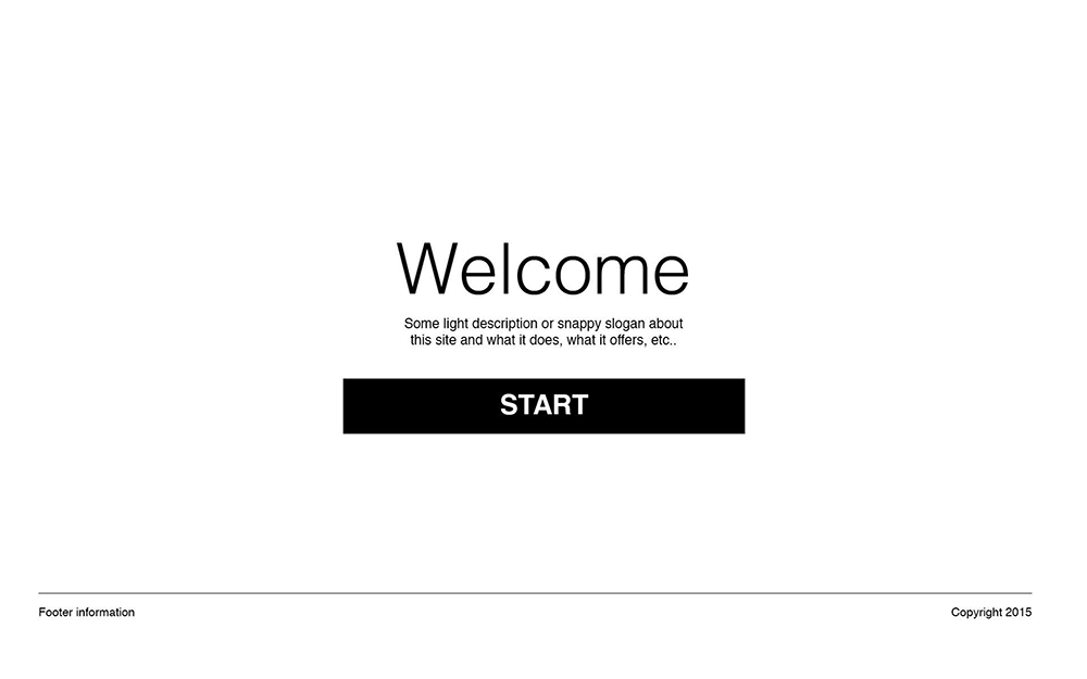
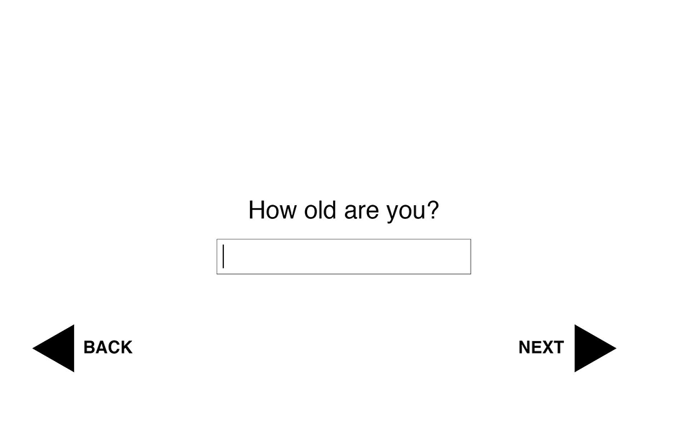
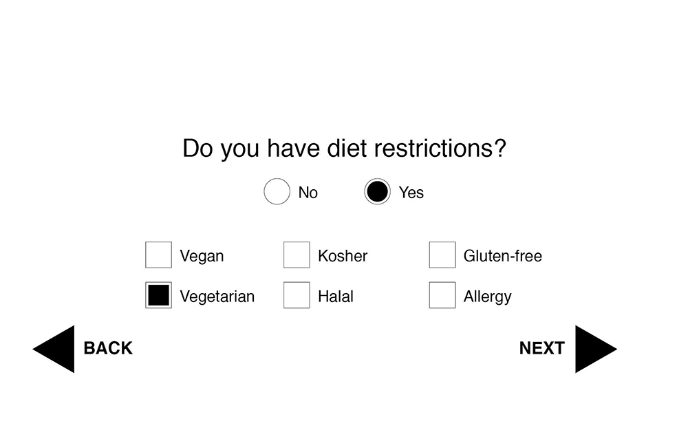
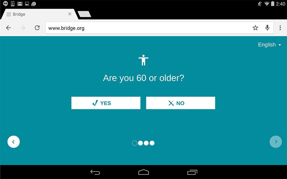
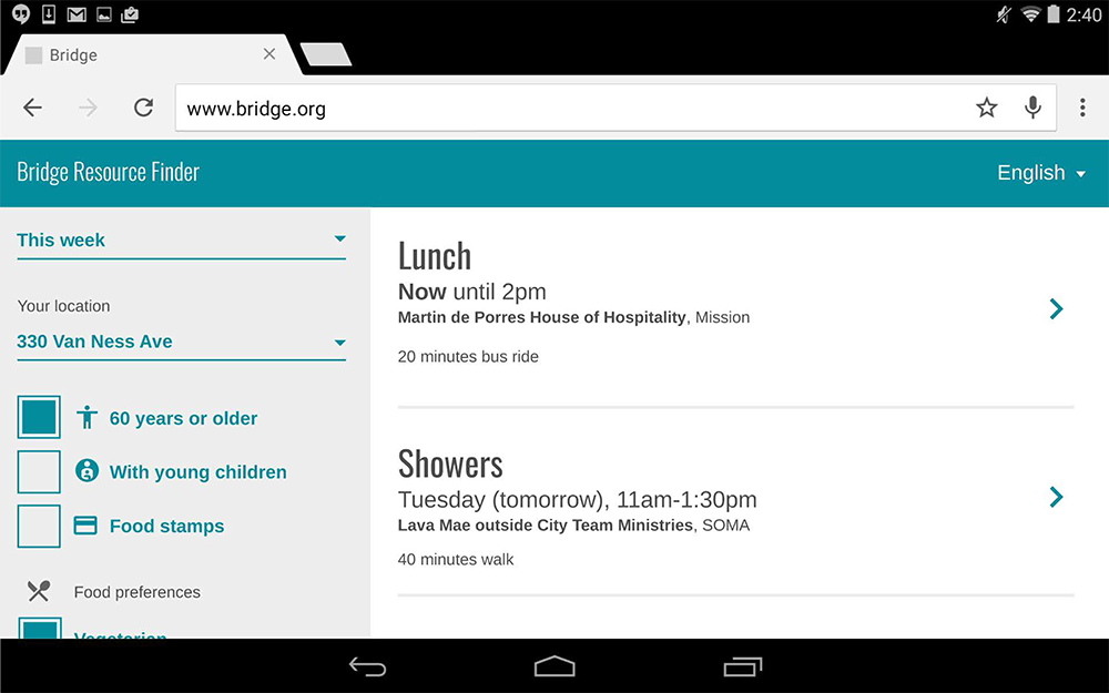
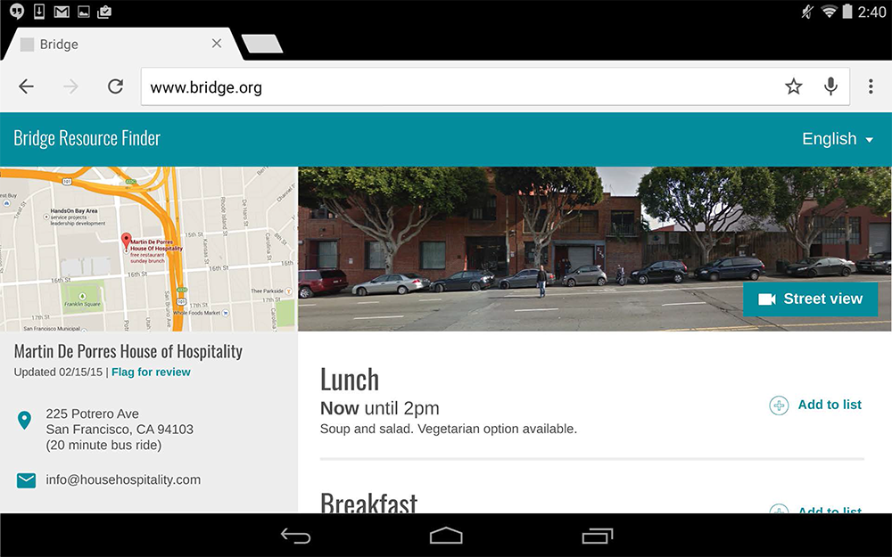
Through research we learned the tablet form factor was perfect for a caseworker to share information with a client. I pitched starting the interaction with a short quiz to target search results.
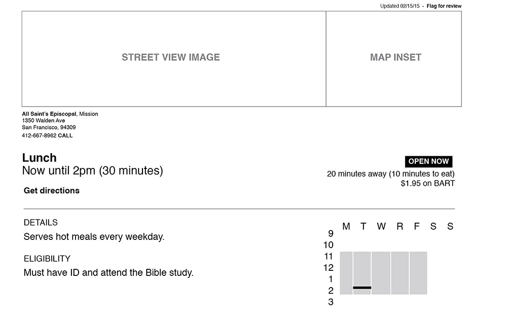
High fidelity
I prepared a high-fidelity prototype with hotspots to click through the experience using an in-house tool similar to Invision. The color and type were pulled from Bridge's existing brand.
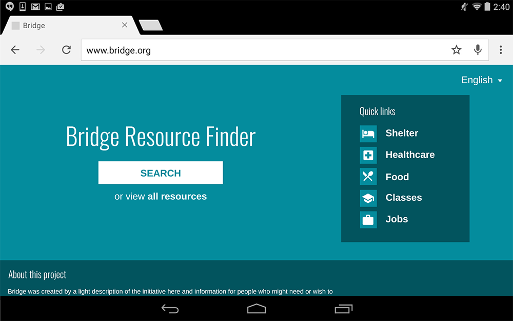
The prototype was presented to the San Francisco mayor's office in 2016. In the time since, the director of Bridge worked with the mayor's office to launch housing.sfgov.org, an incredible step towards helping those at risk gain access to needed resources.